Tuesday, October 20, 2009

INfluence

The Halbeath piece will influence my project because of the way that a place (Halbeath) is described by different ways. The beginning shows you a product of the place (the Motorola phone) while giving you directions to the place. Then the piece goes on to show you current images of the place while listening to an old folk song about the place. The end describes the place with more info written down in loose paragraph form. I am going to try and describe my original place in multiple ways such as text, images and the “character” that is there. I will also be thinking about Shredder 1.0 when thinking about how my character is going to be. I want to use familiar things and transform and combine them in different ways so that they are almost unrecognizable when re-assembled. Shredder does this with websites…I will use that same logic to create a character.

B R A N D O N

Brandon is a piece that doesn’t really keep you guessing. The subject matter is blatantly obvious to the viewer immediately after they see the opening animation. By using universal symbols the artist is assured that the viewer understands what is going on. It is interesting how the artist uses universal, common, everyday symbols to represent something that is virtually unknown and unaccepted to the majority of society. By using the universal symbols it seems as though the artist is trying to say, “HEY, I’m just like you…!” The artist is seemingly trying to explain the person that he is, which is an extremely complicated and unfamiliar subject, in a way that is uncomplicated and familiar to the average joe. Once you go into the project the mood is similar to the intro. The artist is bringing you into their world slowly by revealing pictures as you move the mouse around. The images are probably difficult to look at for the average joe so each time he rolls over the image it changes. The constant changing pictures, as opposed to stationary ones, make the piece as a whole easier to digest. The artist is really concerned about getting their point across; however, they also understand that their point is difficult for people to understand so he uses his piece to cater to those that may usually have difficulty understanding people like Brandon.

A Visitor's Guide to London Heath Bunting, 1995

A visitor’s Guide to London created by Heath Bunting in 1995 is a unique website because in form it resembles a children’s coloring book while the title seems as though the site is going to be strictly informational. When I think of information a children’s coloring book is the last thing I think of...so the site is already interesting before you even start clicking around because you are expecting information and you are presented with child-like drawings. After you make it past the title and opening image you realize that you have the power to go to multiple places from the one picture. This is where this visitors guide is different because of it’s medium. The Internet allows the audience to decide where to go…the pathways that are available (jagged lines, person walking, letter “A”, and intersecting lines) are not exactly indicative of where you are taken next. It’s kind of a surprise! Unlike a traditional map or book, the website allows you to explore London in a new order and way every time you visit the site. I also think it is interesting how the artist uses black and white images to represent an old place while using a medium that allows for such vast interaction and many different color combinations.

Sunday, September 27, 2009

wwwwwwwww.jodi.org


This a screen shot of the first page of wwwwwwwww.jodi.org along with the source code window opened. wwwwwwwww.jodi.org was created by Jodi (Joan Heemskerk and Dirk Paesmans) in 1995. At first glance, Jodi.org's pages seem to be an incomprehensible maze of lines consisting of meaningless code. It’s not until you open the source code, that you see that the page actually does make sense…and somewhat of a statement. I think that the jodi.org artists were trying to achieve some sort of reconciliation between art using a new medium (the web) and art about old ideas (bombs.) It seems to me that the artist is trying to introduce the idea that messages or ideas can easily be encoded using this new machine/language/concept. The artists use a fairly recognizable object and turn it into something completely unrecognizable simply by using a common thing (a browser). I think this artist is showing how easily things can be “encrypted” without the use of an expensive high tech program.


Sunday, September 20, 2009

Shredder 1.0
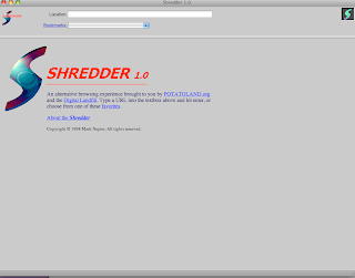
The Shredder 1.0 website was created by Mark Napier in 1998. In his piece summary Napier explains that in his view the web is not a physically representation of information in the same way a magazine or book is, but instead a temporary graphic created when browsing software interprets HTML instruction. The focus of Shredder 1.0 is to reveal this hidden truth behind the Internet and give the user a new interpretation of common web pages. I think Napier realized that most people that use the Internet have no idea how the Internet works or how web pages are created. His piece gives the user a glimpse into how web pages look on “the inside” while adding his artistic spin to them. It also seems that Napier created a new browser, using the “1.0” adds to that conclusion, but, from what I can tell the shredder interprets each site the same way… the individual source code of each site determines how it will display after being put through the Shredder. That is exactly how a browser works. Napier has just created a browser that is more concerned about making an instant art piece rather than conveying what the creator of the web page was actually trying to show.

Monday, September 14, 2009

Superbad


Superbad is a website created by Ben Benjamin in 1997. It seems as though the artist wants to amuse you and also frustrate you at the same time. This site kind of reminds me of those never ending survey pop-ups that keep promising "answer just a few more questions and your FREE snuggie is just moments away!" You really know that the promised snuggie or electric toothbrush or other equally useless item is not really going to be free once you reach the end...and not to mention you would have no desire for this item other than the fact that it was blinking FREE while you were reading your email …but for some reason you have to keep clicking just to see what's next and if you can actually ever reach the end. The Superbad site is similar in that there does not seem to be an end but we just have to keep mindlessly clicking trying to get there! Each page leads to more pages with more options and more decisions to be made. It is very time consuming and frustrating at the same time. After reading the comments the artist has made about the site, it seems that he was really just using the site to experiment and he ended up creating something that mirrors our never ending modern day pop-ups.